 This is a Triangular Plot of an estimate of the 2008 election. In this triangular plot you can see the Liberal Democratic vote, the Conservative vote, and the Labour vote.
Sunday, December 7, 2008
Triangular Plot
 This is a Triangular Plot of an estimate of the 2008 election. In this triangular plot you can see the Liberal Democratic vote, the Conservative vote, and the Labour vote.
Windrose
Climograph
Population Profile

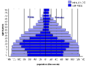
This Population Profile is demonstrating the males and females with and without aids for east and southern Africa.. The left column states their age.
www.ifad.org/operations/regional/pf/aids_1.htm
Remove frame
Scatter Plot
Index Value Plot
Lorenz Curve
Subscribe to:
Posts (Atom)


