Maps
Blog Archive
▼
2008
(53)
▼
December
(24)
Star Plot
Correlation Matrix
Similarity Matrix
Stem and Leaf Plot
Box Plot
Histogram
Parallel Coordinate Graph
Triangular Plot
Windrose
Climograph
Population Profile
Scatter Plot
Index Value Plot
Lorenz Curve
Bilateral Graph
Nominal Area Choropleth Map
Unstandardized Choropleth Map
Standardized Choropleth Map
Univariate Choropleth Map
Bivariate Choropleth Map
Unclassed Choropleth Map
Classed Choropleth Map
Range Graded Proportional Circle Map
Continuously Variable Proportional Circle Map
►
November
(29)
About Me
Danielle
View my complete profile
Friday, December 5, 2008
Univariate Choropleth Map
This Univariate Choropleth Map of the United States shows the percent of individuals living in poverty by county in 2000. This map focuses on a specific set of information as univariate maps should.
http://www.cdc.gov/pcd/issues/2007/oct/images/07_0091_01.gif
No comments:
Post a Comment
Newer Post
Older Post
Home
Subscribe to:
Post Comments (Atom)
 This Univariate Choropleth Map of the United States shows the percent of individuals living in poverty by county in 2000. This map focuses on a specific set of information as univariate maps should.
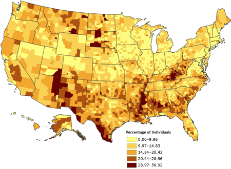
No comments:
Post a Comment