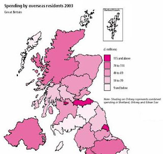
A Classed Choropleth Map uses colors and shading to prove the specific data on the map. This map shows the spending by overseas residents in millions. Each color shade stands for a specific amount group.
http://www.neighbourhood.statistics.gov.uk/dissemination/Info.do?page=userguide/detailedguidance/statisticalpresentation/statisticalmaps/best-practice-statistical-maps.htm
No comments:
Post a Comment