 This is a Star Plot of crime rates in U.S. cities. Each star represents an observation made and one ray is for each variable.
Sunday, December 7, 2008
Star Plot
This is a Star Plot of crime rates in U.S. cities. Each star represents an observation made and one ray is for each variable.Correlation Matrix
 A Correlation Matrix shows correlation between two variables. The correlation matrix usually forms a diagnal from top to bottom.
www.intelligentresults.com/glossary.html
Similarity Matrix
 A Similarity Matrix shows the similiarity between two data points. Similarity matrix are used a lot in showing medical information. There may also be a color scale to easily follow the data.
Stem and Leaf Plot

A Stem and Leaf Plot is one way to prove a set of data. It uses actual numbers to prove a value. This stem and leaf plot is for the number of movies seen last year by students.
Box Plot

A Box Plot shows the data of groups on an interval scale. This is a typical box plot explaining how the information on any given box plot is conveyed. The box plot is an organized way to groups various amounts of information together.
Histogram
A Histogram is graphically shown as bars. Histograms can be arranged either horizontally or vertically.
Parallel Coordinate Graph

In Parallel Coordinate Graphs each variable cooresponds to an axis. They are used to plot large amounts of data. Some may use different colors to differentiate the information.
Triangular Plot
 This is a Triangular Plot of an estimate of the 2008 election. In this triangular plot you can see the Liberal Democratic vote, the Conservative vote, and the Labour vote.
Windrose
 A Windrose shows how wind speed and direction are distributed. A windrose is represented in a circular image. Here in this windrose colors are used to distinguish between calmness and severity.
Climograph

A Climograph is made up of a line graph and a bar graph. The line graph is used to show temperature and the bar graph is used to show precipitation.
Population Profile

This Population Profile is demonstrating the males and females with and without aids for east and southern Africa.. The left column states their age.
www.ifad.org/operations/regional/pf/aids_1.htm
Remove frame
Scatter Plot

Scatter Plots are similar to line graphs and could be used up to four dimensions. This scatter plot was taken from the army website showing SAT versus Beta tests.
Index Value Plot
 Index Value Plots help to show differences. They usually use lines and can use different colors to help distingish differences better. This shows the average prices for wine sold at commercial auctions.
Lorenz Curve

A Lorenz Curve shows inequality of some sort. Lorenz curves all have the same typical illustration in representing their data and are most frequently used involving economics. This Lorenz curve shows economic growth in Scotland.
Bilateral Graph

A Bilateral Graph is a line graph that shows two different variations. This map was found on the U.S. Department of State website and it is showing USG Total Assistance.
Nominal Area Choropleth Map

A Nominal Area Choropleth Map uses nominal data to display the information desired. They usually show quantitative differences. Using properties of a constant unit is the best way to avoid any mapping errors. This map shows the percent of persons who are hispanic or Latino of any race.
Friday, December 5, 2008
Unstandardized Choropleth Map
 This Unstandardized Choropleth Map is using data to represent about the percent with tertiary education. There is no particular order to the map type.
https://campus.fsu.edu/webapps/portal/frameset.jsp?tab_id=_2_1&url=%2Fwebapps%2Fblackboard%2Fexecute%2Flauncher%3Ftype%3DCourse%26id%3D_6278860_1%26url%3D
Standardized Choropleth Map
 This is a Standardized Choropleth Map that helps distinguish between different data. The different population by age is used in the key.
Univariate Choropleth Map
 This Univariate Choropleth Map of the United States shows the percent of individuals living in poverty by county in 2000. This map focuses on a specific set of information as univariate maps should.
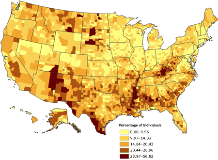
Bivariate Choropleth Map
 Bivariate Maps use color to determine and prove data. This map reveals relationships between variables.
Thursday, December 4, 2008
Unclassed Choropleth Map
 This Unclassed Choropleth Map is very unclear. The communication the map is trying to convey in confusing. In unclassed choropleth maps the data is not classified.
Classed Choropleth Map

A Classed Choropleth Map uses colors and shading to prove the specific data on the map. This map shows the spending by overseas residents in millions. Each color shade stands for a specific amount group.
http://www.neighbourhood.statistics.gov.uk/dissemination/Info.do?page=userguide/detailedguidance/statisticalpresentation/statisticalmaps/best-practice-statistical-maps.htm
Range Graded Proportional Circle Map
 This is a Range Graded Proportional Circle Map mainly of Europe. The size of the circles show the data that is being determined.
Monday, December 1, 2008
Continuously Variable Proportional Circle Map
 In this Continuously Variable Proportional Circle Map the internet users of 2004 in Europe is being measured. Using point data is one way to demonstrate statistics on a map using easily recognized circles.
http://www.geog.ucsb.edu/~jeff/gis/proportional_symbols_files/map1.jpg
Sunday, November 30, 2008
DOQQ
 DOQQ or Digital Orthographic Quarter Quads are aerial photos with map qualities. This is clearly an aerial photo. It is used by the University of Texas Civil Engineering in preparation for flood insurance.
http://www.crwr.utexas.edu/gis/gishydro00/Class/trmproj/Donnelly/termproject_files/1_Red_DOQQ.jpe
DEM

A DEM or digital elevation model shows different terrain elevation. This DEM is colorized so the different elevations are easy to read; it is also 3D.
DLG

DLG maps show a lot of different information. This Digital Line Graph is of Columbus, Georgia. There is a key to the map at the top showing the meaning of each line on the map.
http://ga.water.usgs.gov/olympics/columbus.dlg.gif
DRG

A DRG (digital raster graphic) map is a type of U.S. Geological Survey. This DRG map was taken from the Illinois Natural Resource Geospacial Data Clearinghouse.
Isopleth
 This Isopleth map shows rainfall from 1961-1990. This map was created by the Oregon Climate Service at Oregon State University.
http://images.google.com/imgres?imgurl=http://www.krisweb.com/kristenmile/krisdb/html/krisweb/maps/ten_rain_map.gif&imgrefurl=http://www.krisweb.com/kristenmile/krisdb/html/krisweb/maps/geomap_ten.htm&usg=__ok010IRPntvEVMV0O7lZXD8oJTU=&h=630&w=1022&sz=113&hl=en&start=2&um=1&tbnid=PGw2rhbstnSrWM:&tbnh=92&tbnw=150&prev=/images%3Fq%3Disopleth%2Brain%2Bmap%26um%3D1%26hl%3Den%26rls%3DSUNA,SUNA:2006-04,SUNA:en
Isopach

http://images.google.com/imgres?imgurl=http://higheredbcs.wiley.com/legacy/college/levin/0471697435/chap_tut/images/le08_16.jpg&imgrefurl=http://higheredbcs.wiley.com/legacy/college/levin/0471697435/chap_tut/chaps/chapter10-06.html&usg=__M5UBtfqg9KsYCHPMEHOTR0XjLmU=&h=273&w=370&sz=23&hl=en&start=1&um=1&tbnid=pn1P_0Tvhz4rUM:&tbnh=90&tbnw=122&prev=/images%3Fq%3Disopach%2Bgreat%2Blakes%26um%3D1%26hl%3Den%26rls%3DSUNA,SUNA:2006-04,SUNA:en%26sa%3DN
Isohyet
 An Isohyet is a line on a map connecting places having equal rainfall. This map was taken off of the Hong Kong weather website.
http://images.google.com/imgres?imgurl=http://www.weather.gov.hk/informtc/prapiroon/prapiroon_rf.gif&imgrefurl=http://mattsmapcatalog.blogspot.com/2008/08/isohyets.html&usg=__O7ui_GZGohVPX7UR1Qs8KY-lnjE=&h=464&w=618&sz=110&hl=en&start=2&um=1&tbnid=YdSIw7iwfBwsuM:&tbnh=102&tbnw=136&prev=/images%3Fq%3Disohyet%2Bhong%2Bkong%26um%3D1%26hl%3Den%26rls%3DSUNA,SUNA:2006-04,SUNA:en
Isotachs
 Isotachs are also found on a weather map and are used to show different wind speeds. This map is of Mexico and the western United States. When the Isotach lines are close together, that is where the wind is the strongest.
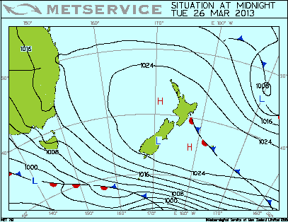
Isobars
 Isobars are used to show different pressures on a map. This is a map of New Zealand that is updated on this particular website three different times each day.
http://www.grownups.co.nz/uploads/weather/analysis_0000.gif
Thursday, November 27, 2008
LIDAR

http://www.csc.noaa.gov/products/sccoasts/html/images/lhilt.gif
Doppler Radar
 Doppler Radars show the base reflectivity of an image. This is a doppler radar image of Tropical Storm Alberto in 2006. Doppler radar images can be viewed on the internet as the image is moving. They also show the severity of the storm and rain using a color coded system.
http://www.srh.noaa.gov/tlh/images/landfall_0606131619.png
Black and White Aerial Photo
 Black and White Aerial Photos always seem to have a great amount of character and history. This photo is by the USGS taken of the New York Inlet.
http://pics3.city-data.com/city/tmap2/tun966.png
Infrared Aerial Photo
 This is an Infrared Aerial photo of the Sacramento deep water channel. Infrared aerial photography is also very important to our environment because of its ability to detect any changes.
http://www.aerialarchives.com/imagedb/IR0010154f.jpg
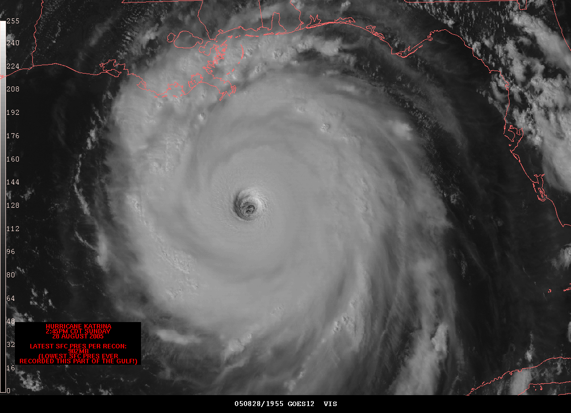
Cartographic Animation
 This is a Cartographic animation of Hurricane Katrina approaching Louisiana. This cartographic animation makes it easy to read the hurricane and examine the eye. Because the eye of the hurricane is so important to study, this animation makes determining the severity available to people.
http://www.spc.noaa.gov/misc/carbin/katrina/kat5_1945.gif
Tuesday, November 25, 2008
Statistical Map
 This is a Statistical Map that shows the percent change in Metropolitain and Micropolitan Area Pollution from April 1, 2000 to July 1, 2000. This is an important map to become familair with and comfortable reading. It can help you learn about issues that surround us, such as pollution.
http://www.census.gov/popest/gallery/maps/map_20002005.jpg
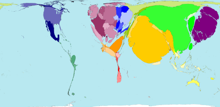
Cartograms
 I found this Cartogram using a website called Worldmapper. On this map, Worldmapper uses a new algorithm to proportionally represent rail passenger traffic world wide. As you can see, this is not like a typical map of the world, but it has been set to proportional size to demonstrate a certain topic.
http://www.mcwetboy.net/maproom/images/worldmapper_cartogram.png
Flow Map

http://www.frankley.school.nz/uploads/images/flowmap_lge.jpg
Isoline Map
 This particular Isoline Map is of Mexico. It is showing the mean annual percipitation. Mazatlan has the highest annual mean as shown by the closeness of the isolines on the map.
http://www.lib.utexas.edu/maps/atlas_mexico/mean_annual_precipitaion.jpg
Tuesday, November 18, 2008
Proportional Circle Map

This is a Proportional Circle Map representing population for the selected group in Canada.
Choropleth Map

This Choropleth Map, like many others uses a graphic variable to show quantitative differences. This represents the percent of Hispanic people per county in Florida based on a census in 2000.
Sunday, November 16, 2008
Dot Distribution Map
 This is a dot distribution map showing the growth of Wal-Mart. You can see how Wal-Mart started off slow and eventually began to rapidly spread.
Propaganda Map
 Because Propaganda Maps are mostly used for aiming malicious intent, here is a map indicating the Nazi Policy.
http://www.bl.uk/whatson/images/10.jpg
Hypsometric Map

Hypsometric Maps are known for using various shades and colors to show different elevations. The more distinct the cotours in the map, the easier it is to read. This Hypsometric Map of Hawaii gives a key using feet and meters to show its elevations.
PLSS Map
 This PLSS Map is of Alabama. The grid lines are used to survey land for recording ownership. The township in blue is Franklin County.
Friday, November 14, 2008
Cadastral Map

This Cadastral map shows how a specific area of land is divided into its real property.
http://balloonaerialphoto.com/images/cadastral_thumb.jpg
Subscribe to:
Posts (Atom)