 This is a Star Plot of crime rates in U.S. cities. Each star represents an observation made and one ray is for each variable.
Sunday, December 7, 2008
Star Plot
This is a Star Plot of crime rates in U.S. cities. Each star represents an observation made and one ray is for each variable.Correlation Matrix
 A Correlation Matrix shows correlation between two variables. The correlation matrix usually forms a diagnal from top to bottom.
www.intelligentresults.com/glossary.html
Similarity Matrix
 A Similarity Matrix shows the similiarity between two data points. Similarity matrix are used a lot in showing medical information. There may also be a color scale to easily follow the data.
Stem and Leaf Plot

A Stem and Leaf Plot is one way to prove a set of data. It uses actual numbers to prove a value. This stem and leaf plot is for the number of movies seen last year by students.
Box Plot

A Box Plot shows the data of groups on an interval scale. This is a typical box plot explaining how the information on any given box plot is conveyed. The box plot is an organized way to groups various amounts of information together.
Histogram
A Histogram is graphically shown as bars. Histograms can be arranged either horizontally or vertically.
Parallel Coordinate Graph

In Parallel Coordinate Graphs each variable cooresponds to an axis. They are used to plot large amounts of data. Some may use different colors to differentiate the information.
Triangular Plot
 This is a Triangular Plot of an estimate of the 2008 election. In this triangular plot you can see the Liberal Democratic vote, the Conservative vote, and the Labour vote.
Windrose
 A Windrose shows how wind speed and direction are distributed. A windrose is represented in a circular image. Here in this windrose colors are used to distinguish between calmness and severity.
Climograph

A Climograph is made up of a line graph and a bar graph. The line graph is used to show temperature and the bar graph is used to show precipitation.
Population Profile

This Population Profile is demonstrating the males and females with and without aids for east and southern Africa.. The left column states their age.
www.ifad.org/operations/regional/pf/aids_1.htm
Remove frame
Scatter Plot

Scatter Plots are similar to line graphs and could be used up to four dimensions. This scatter plot was taken from the army website showing SAT versus Beta tests.
Index Value Plot
 Index Value Plots help to show differences. They usually use lines and can use different colors to help distingish differences better. This shows the average prices for wine sold at commercial auctions.
Lorenz Curve

A Lorenz Curve shows inequality of some sort. Lorenz curves all have the same typical illustration in representing their data and are most frequently used involving economics. This Lorenz curve shows economic growth in Scotland.
Bilateral Graph

A Bilateral Graph is a line graph that shows two different variations. This map was found on the U.S. Department of State website and it is showing USG Total Assistance.
Nominal Area Choropleth Map

A Nominal Area Choropleth Map uses nominal data to display the information desired. They usually show quantitative differences. Using properties of a constant unit is the best way to avoid any mapping errors. This map shows the percent of persons who are hispanic or Latino of any race.
Friday, December 5, 2008
Unstandardized Choropleth Map
 This Unstandardized Choropleth Map is using data to represent about the percent with tertiary education. There is no particular order to the map type.
https://campus.fsu.edu/webapps/portal/frameset.jsp?tab_id=_2_1&url=%2Fwebapps%2Fblackboard%2Fexecute%2Flauncher%3Ftype%3DCourse%26id%3D_6278860_1%26url%3D
Standardized Choropleth Map
 This is a Standardized Choropleth Map that helps distinguish between different data. The different population by age is used in the key.
Univariate Choropleth Map
 This Univariate Choropleth Map of the United States shows the percent of individuals living in poverty by county in 2000. This map focuses on a specific set of information as univariate maps should.
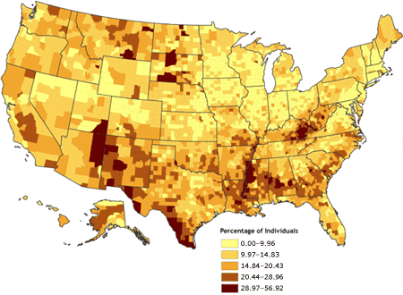
Bivariate Choropleth Map
 Bivariate Maps use color to determine and prove data. This map reveals relationships between variables.
Thursday, December 4, 2008
Unclassed Choropleth Map
 This Unclassed Choropleth Map is very unclear. The communication the map is trying to convey in confusing. In unclassed choropleth maps the data is not classified.
Classed Choropleth Map

A Classed Choropleth Map uses colors and shading to prove the specific data on the map. This map shows the spending by overseas residents in millions. Each color shade stands for a specific amount group.
http://www.neighbourhood.statistics.gov.uk/dissemination/Info.do?page=userguide/detailedguidance/statisticalpresentation/statisticalmaps/best-practice-statistical-maps.htm
Range Graded Proportional Circle Map
 This is a Range Graded Proportional Circle Map mainly of Europe. The size of the circles show the data that is being determined.
Monday, December 1, 2008
Continuously Variable Proportional Circle Map
 In this Continuously Variable Proportional Circle Map the internet users of 2004 in Europe is being measured. Using point data is one way to demonstrate statistics on a map using easily recognized circles.
http://www.geog.ucsb.edu/~jeff/gis/proportional_symbols_files/map1.jpg
Subscribe to:
Comments (Atom)